 |
| Sometimes I think, Sometimes I am |
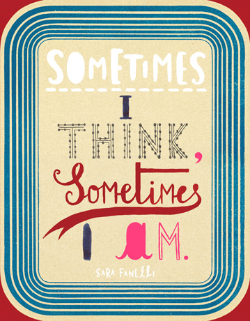
I really like Sara Fanelli's work because it's very intricate and detailed. I like her use of type and the randomness of each word in her 'sometimes I think sometimes I am' pieces. I can see she has done this so that each piece of lettering conveys a different message, to create something overall as a set piece.The colour she uses, especially in this series is limited. It shows she has thought about this in a selective manner and has thought about how many colours she should use and which ones they should be. I find her interesting as her drawings are capturing and I like her delicate style.
With the bird piece, I like the fact that she has used grounds to work on to associate with the quote she has also added onto the piece. Again, this shows she has thought about what she should work on, as well as the arrangement of the aspects to make her piece as a whole.
 |
| Sometimes I think, Sometimes I am |
 | |
| Anime Taste |

I have taken an interest into this artist's work because I like the simplicity of his illustrations, combined with the flooding tones of a selected colour. I think these colours help to create different moods for the characters he is creating. You can see his drawings aren't very detailed, but the precise lines are able to represent his skills just as well. Sometimes less is more and in this case I think this definitely works.
For example, for the lady and cat drawing, the mood
created is quite cold and lonely due to the blue and yellow colours used. These create quite a sad feel, but also this is clever as they say cats can pick up on your emotions, therefore it is next to the human.
No comments:
Post a Comment